Many printers will tell you their color is better than the competition. Some of those claims are more exaggeration than fact. But there are specific circumstances that really can make a difference.
Proper utilization of color management is one of them.
In our business (on-demand large-format printing), files and art come from a lot of different sources and not everyone producing them understands the variables of color management.
To avoid hassles and minimize production problems, most print shops ask customers to ‘convert to CMYK‘. But by complying with this request, customers are reducing the colors available in their graphics to what amounts to ‘the lowest common denominator’.
Benchmark is different.
The CMYK most people convert to is SWOP. The acronym stands for “Specification for Web Offset Publishing” and it is an organization as well as a set of specifications. It predates digital color and provided a consistent standard for web and offset printing in the United States.
With SWOP, it became possible to print the same ad in many publications, by many printers, and have it look consistent.
But CMYK/SWOP became the dominant standard partly because it was somewhere between great color and inferior color.
As Photoshop took over, its USWebCoated (SWOP) became the de facto color profile because it was closest to the old SWOP standard everyone was used to.
SWOP isn’t bad; most photographic images can be reproduced reasonably well in it. But with the advent of digital photography and the ease of creating colorful complex layouts, lots of the new color capability made possible by the digital age can get short changed if its converted to SWOP.
Pantone colors are a great example. Some will be fine when converted, others won’t. There are so many problems reproducing Pantone colors in CMYK/SWOP, the company publishes a swatch book called Color Bridge to help designers know what will happen to their color picks if they are converted. (formerly called ‘Solid to Process Guide’).
A quick look through this swatch book shows where CMYK/SWOP color falls short. Pantone #165 and #286 are good examples of how poorly some translate. The point is, Color Bridge is a visual example of what is happening to your graphic files when you “convert to CMYK”.

Why are the colors different?
Because Pantone uses more colorants than the four colors used in CMYK/SWOP (cyan, magenta, yellow and black).
Originally Pantone was an Ink System and PMS, in the color world, stands for Pantone Matching System. They created a large set of color inks and swatch books to go with them so designers could pick what they wanted for their layout and communicate it, by number, to the printer. The printer would then buy that specific ink color from Pantone and be guaranteed to have the right color on the printed page.
To produce the inks, Pantone literally uses any colorant on the planet. Alternatively, SWOP, by definition, includes only the colors that can be made by mixing the SWOP primaries: cyan, magenta, yellow, and black. And the fact is, there is no combination of those four primaries that will create 165 Orange or 286 Blue. In color science terms the Pantone colors are out of gamut.
Here’s the crux: When a print house tells you to ‘convert to CMYK’, your colors are reduced to a lower common denominator.

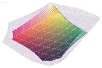
The same thing happens to color images. The colored image (above) shows the range available with CMYK/SWOP. The gray area around it represents the color range captured by a typical digital camera.
If you ‘convert to CMYK’, any colors that started out in the gray area are moved (compressed) into the smaller color space of CMYK/SWOP.
At Benchmark our printing machines use ink and dye sets that also yield color gamuts with areas outside of SWOP. Our color management allows our printing to take advantage of those brighter colors. But if you convert to CMYK before submitting your files, the colors are no longer there for us to print.
One more point should be made about digital images. All should carry a profile. Without a profile, RIPs, the processing step that drives the printing process, will assign a default profile which may or may not be right for your image and a variety of things may look different when it prints.
Here’s the bottom line: at Benchmark, we ask that our customers leave their files in the native formats and the profiles/color spaces they were created in.
1) If an image starts as an sRGB jpeg we recommend leaving it as such.
2) If your original image is profiled as a SWOP CMYK, leave it as is. It has already been converted to the smaller color space. Reconverting it will not bring back lost colors. ColorSpace “conversions” are a one way street.
3) Leave your Illustrator and InDesign files in the profiles you normally work in.
4) If your files use Pantone colors, leave them as Pantone colors (spot colors) – do not “convert to process”.
In all instances your color will be better and truer than if you converted them. The result of you doing less to submit your files will be better color.
* * * * *
If this topic interests you, there is plenty more material to keep your propeller spinning:
• The best reference and HowTo explanation for color management we’ve found is the book Real World Color Management (2nd edition). Its available at Amazon.com.
• For more on the history of Pantone: http://en.wikipedia.org/wiki/Pantone
• SWOP standards: http://en.wikipedia.org/wiki/Specifications_for_Web_Offset_Publications
• Color Gamuts see: http://en.wikipedia.org/wiki/Color_gamut
• For visualizing color gamuts, look up ‘Comparing two color profiles’ in the Apple ColorSync Utility Help menu
Benchmark Imaging & Display. Call us and speak to a sales rep today 847-290-0002
SEE WHAT WE CAN DO FOR YOUR IMAGE

