
1. The Booth Doesn’t Grab Attention Fast Enough
Trade show attendees don’t typically stop at every booth and carefully read every sign. They walk the aisles looking for something that catches their eye. That means exhibitors have a very small window to make an impression. Your booth graphics need to communicate three things almost immediately:- Who you are
- What you offer
- Why someone should stop and learn more
2. Poor-Quality Graphics Can Hurt Your Brand
Your trade show booth is often one of the most visible representations of your company at an event. If the graphics look blurry, faded, pixelated, or poorly printed, attendees may subconsciously associate that quality with your brand. Professional-looking displays, on the other hand, can immediately communicate credibility. This is where high-quality large-format printing makes a difference. Sharp images, clean text, vibrant colors, and properly finished graphics can dramatically improve the look of displays and help your booth stand out in a busy exhibit hall.3. Color Accuracy Matters More Than You Think
Brand consistency is especially important at trade shows. Your logo and brand colors may appear on your website, business cards, product packaging, social media, signage, and marketing materials. Your booth should look like the same brand. That’s why color accuracy to brand image is so important when producing trade show graphics. A color that looks correct on a computer screen may not reproduce exactly the same way when printed. Differences in materials, printing processes, lighting, and finishing can affect the final appearance. Professional large-format printing should prioritize accurate color reproduction so your booth graphics represent your brand the way you intended. When your graphics, logo, photography, and colors work together, the entire exhibit looks more polished and professional.4. The Graphics Don’t Take Advantage of the Display Structure
A trade show booth isn’t just a collection of signs. The physical structure creates opportunities for graphics to work together as one visual experience. For example, an SEG fabric display can provide a clean, seamless appearance with graphics designed specifically to fit the frame. Instead of looking like separate signs attached to a structure, the graphics can create one cohesive branded backdrop. The right graphic solution can also help eliminate visual distractions such as unnecessary seams, gaps, or hardware.Consider SEG Fabric for a Clean, Professional Look
SEG, or Silicone Edge Graphics, uses a silicone strip sewn into the edge of the fabric graphic. The strip fits into a frame channel, creating a taut graphic surface. The result is a modern, streamlined appearance that works particularly well for trade show backwalls, modular exhibits, and other display systems. For brands that want a polished and contemporary booth, SEG fabric can be an excellent graphic solution.5. The Booth Doesn’t Use Lighting Effectively
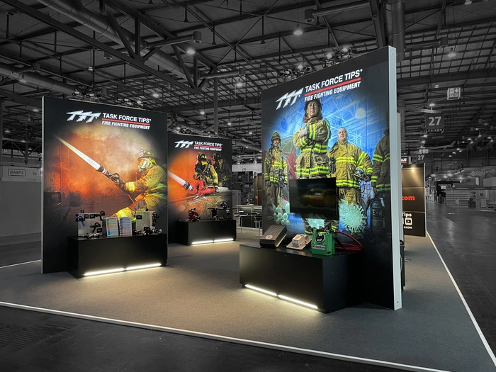
Lighting can completely change the appearance of a trade show display. A booth with strong graphics but poor lighting can still get lost in a busy exhibit hall. On the other hand, illuminated graphics can create an eye-catching focal point that draws attention from the aisle. Backlit fabric is one option exhibitors can use to make their graphics stand out. Backlit displays use lighting behind the printed fabric, allowing the graphic to glow and creating a bright, high-impact visual. They can be particularly effective for logos, product imagery, promotional messaging, and large photographic graphics. The combination of high-quality printing and properly illuminated backlit fabric can give your exhibit a premium appearance while helping it stand out among neighboring booths.6. There’s Too Much Information on the Walls
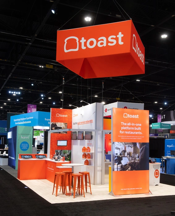
One of the most common trade show mistakes is trying to say everything. Your booth isn’t a brochure. If attendees have to stop and read a paragraph before they understand what your company does, you’ve already made the process too difficult. Instead, use your booth graphics to create a visual hierarchy: Large headline → Supporting message → Brand/product imagery → Call to action Keep the most important message at eye level and make it easy to understand from the aisle. Then, once someone stops, your team can provide the details and have a conversation.7. The Booth Looks Different From the Rest of the Brand
Imagine walking into a trade show and seeing a company with one color palette on its website, another on its printed materials, and completely different colors on its booth. That inconsistency can make the company appear less established. Your exhibit should feel like an extension of your existing brand. From color accuracy and brand imagery to typography, photography, logos, and messaging, every graphic element should work together. Consistency builds recognition, and recognition helps attendees remember your company after the trade show is over.8. The Graphics Were Treated as an Afterthought
Many exhibitors spend considerable time choosing a booth structure, furniture, flooring, lighting, and promotional products—but don’t give enough attention to the graphics. That’s backwards. The structure creates the space. The graphics create the message. Your booth graphics are what tell attendees who you are and what you want them to know. They also play a major role in determining the overall look of your display and the perceived quality of your exhibit. That’s why graphics should be considered early in the booth planning process, not at the end. Working with a large-format printing provider early can help ensure that your designs, dimensions, materials, colors, and finishing requirements are all coordinated before production.